HackNYU 2025-26
We needed a cohesive digital ecosystem for 600+ developers navigating a fast-paced 48-hour hackathon. Anchored by an NYC Subway theme, I designed a unified brand identity and mobile-first interface to streamline event logistics and enhance the attendee experience.
UX
AI
HACKATHON

Role: Brand & Experience Designer (Core Team)
Timeline: Fall 2025 - Spring 2026
Theme: NYC Subway & Transit Systems
Scope: Design System, Web UI, Social Media, Print & Merchandise
Tools: Figma, Adobe Illustrator, React (Design Handoff)
Summary
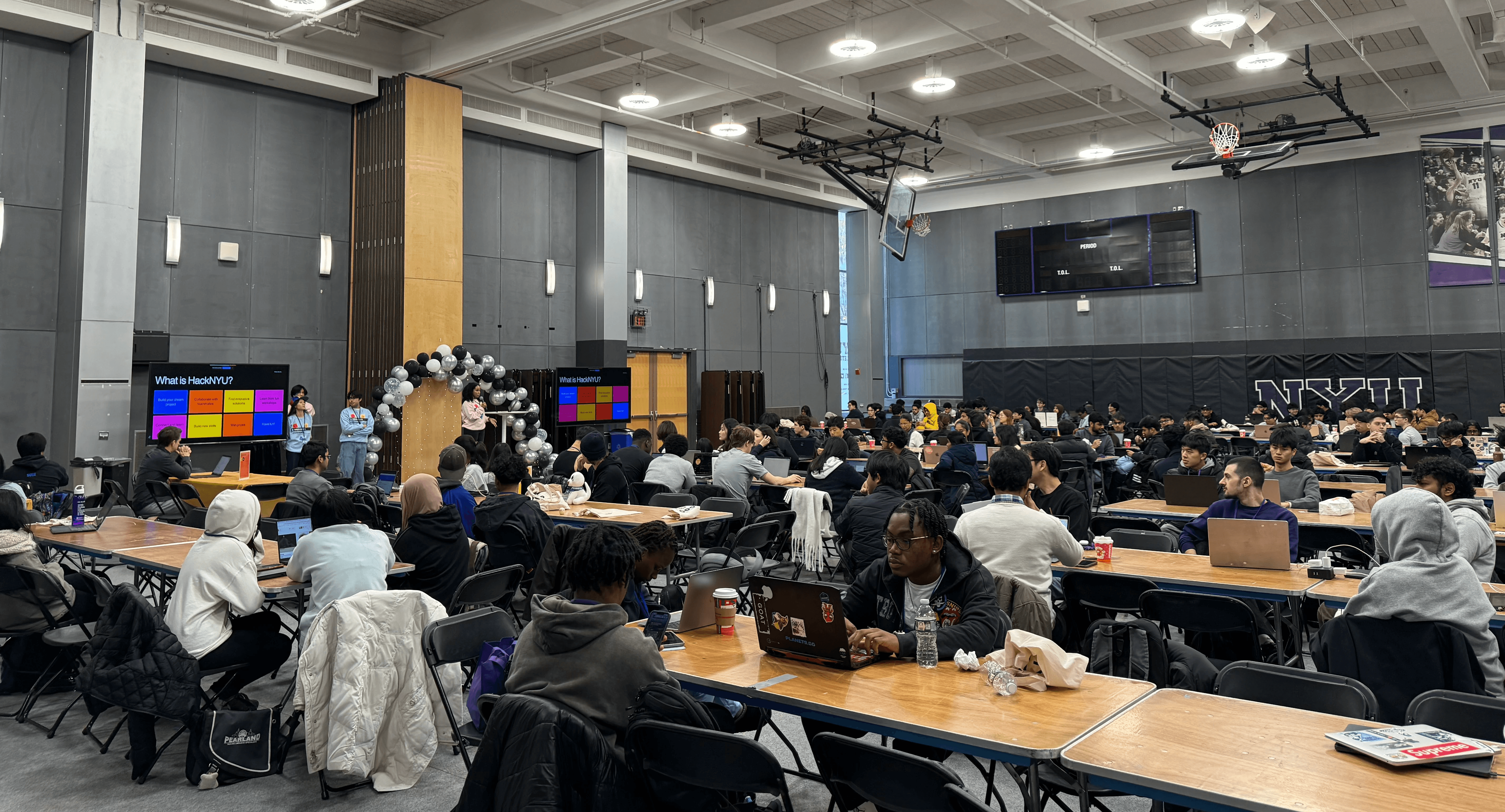
I led the visual identity and experience design for HackNYU, creating a cohesive "NYC Subway" themed ecosystem for 600+ attendees.
The concept wasn't just aesthetic; it was functional. A hackathon, like the subway, is a complex network of moving parts, fast-paced timelines, and diverse tracks. I utilized the visual language of transit maps, bold lines, distinct color coding, and clear signage to solve the primary user problem: Navigation.
Challenge: Wayfinding in Chaos
Problem Statement:
Hackathons suffer from information overload. Participants ("Commuters") need to know where to go (Workshops), which track they are on (Themes), and when the next event arrives (Schedule).
The Solution:
I treated the event interface as a Digital Transit Map.
Instead of standard menus, I developed a Wayfinding System inspired by Massimo Vignelli’s iconic NYC subway maps. The goal was to reduce cognitive load by treating every "Track" (Sustainability, Health, EdTech) as a literal subway line with its own color identity and "stops" (milestones).
Web Experience: The Digital Map
Key UX Decisions:
"Tracks" as Subway Lines: The visual hook of the mobile interface (seen in the main image) uses continuous colored lines that physically connect different sections of the page. This guides the user's eye down the "route" of the hackathon.
Station-Style Cards: Information is grouped into rounded, high-contrast cards that mimic subway signage. This modularity allowed us to stack content (Sponsors, Recaps, FAQs) like stops on a route, ensuring the hierarchy remained clear even on small mobile screens.
The "Service Status" Board: The schedule wasn't just a list; it functioned like a station arrival board. We used high-contrast typography to make "Current Events" pop against the dark mode background, essential for tired hackers coding at 3 AM.
The Design System
Visual Language:
Typography: We utilized a clean, bold sans-serif similar to Helvetica (the font of the NYC subway) to ensure maximum readability at a glance.
Color Coding:
Red/Blue/Yellow Lines: Used to differentiate the specific hacking tracks.
Black/Dark Grey: The background "tunnel" environment to reduce eye strain (Dark Mode).
White: High-contrast text for critical "Signage" (Headlines).
Social Media Strategy:
We treated social announcements like "Service Advisories."
"Delays" & "Arrivals": Application deadlines were framed as "Last Train" alerts, creating urgency.
Route Maps: Workshop announcements were visualized as stops on a line, helping participants visualize their learning journey.
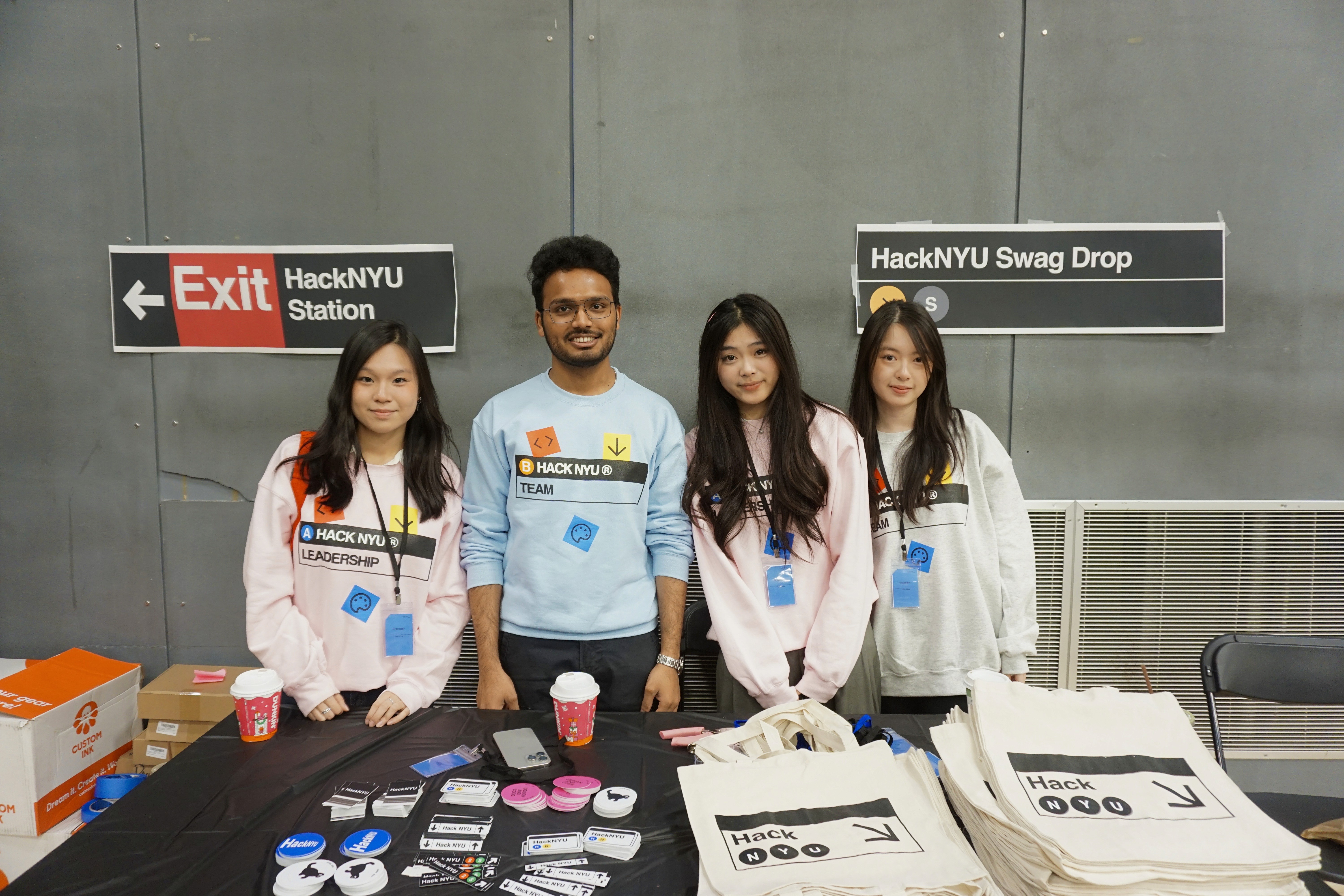
Apparel: Wearable Wayfinding
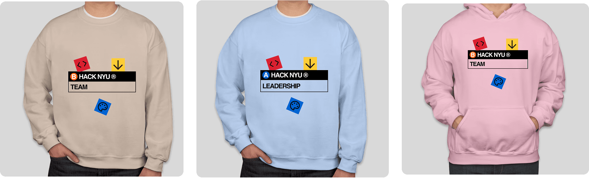
The "Commuter" Hoodie
For the merchandise, I wanted to capture the organized chaos of the subway map without the clutter.
Chest "Signage": The front design mimics the subway station entrance signage. We used the "colored circle" icons to represent the different "lines" (teams/tracks) involved in the event.
Back "Transfers": The back design creates an abstract map interaction, symbolizing the connection between different disciplines (Engineering, Design, Business) just like a transfer at Union Square.
Pastel Contrast: We softened the harsh subway black/white into approachable pastels (Beige, Pink, Blue) to make the swag feel like premium streetwear rather than corporate event gear.
Stickers & Mascot
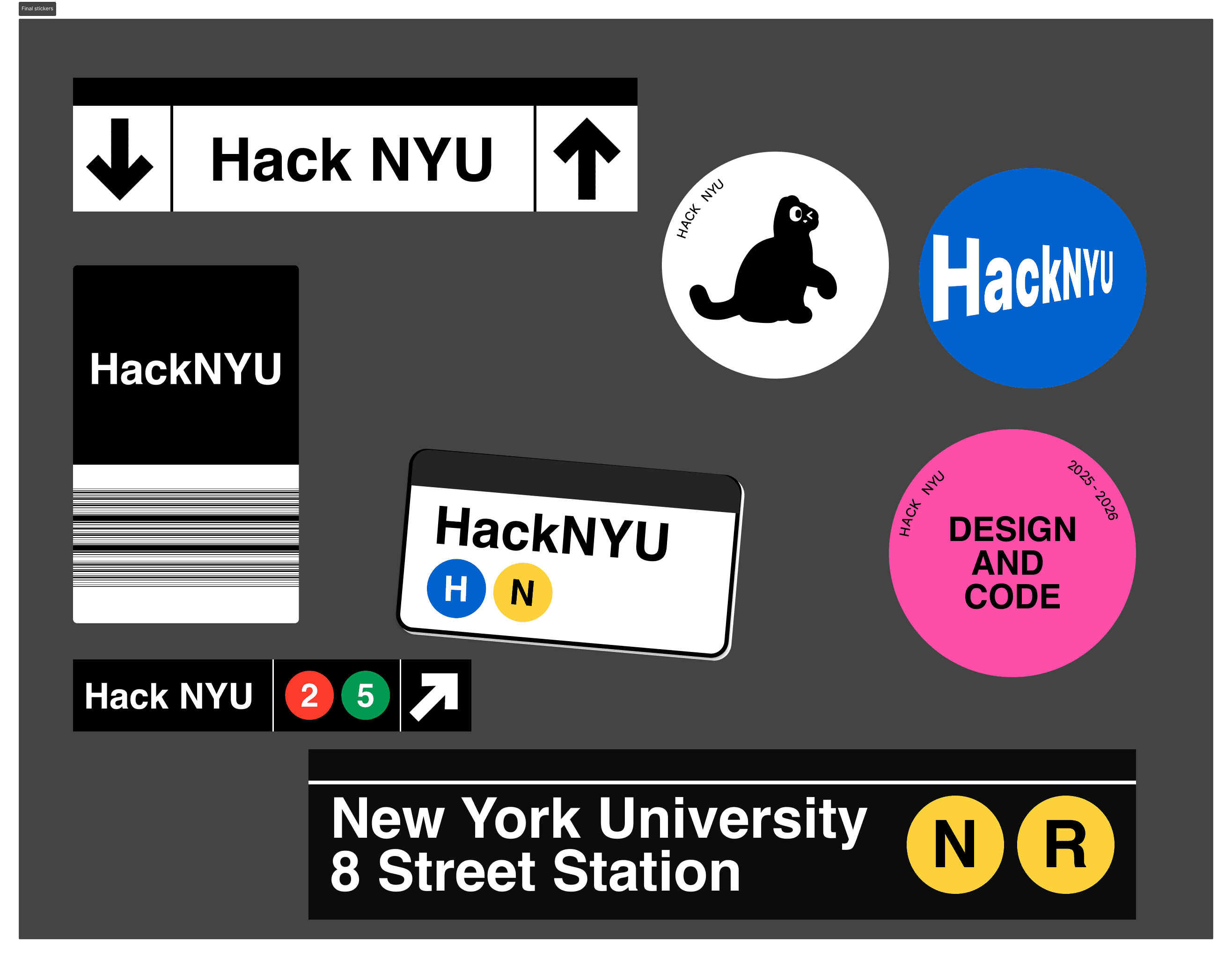
The "HackNYU Cat" Commuter
Mascot: We placed the HackNYU Cat into the subway context—waiting at the turnstile or holding the rail. This added a layer of relatable storytelling (the "tired commuter") that resonated with exhausted students.
Tokenization: The stickers were designed to look like subway tokens and line indicators (the N, Q, R bullets), making them highly collectible "badges" of participation.
Impact
Navigation Success: 600+ attendees successfully navigated a 48-hour agenda with minimal logistical friction.
System Scalability: The "Line & Stop" design system allowed us to add last-minute sponsors and workshops simply by adding a "stop" to the existing visual line, without breaking the layout.
Brand Recall: The subway theme created an instant connection to the NYC location, grounding the event in the energy of the city.