Aira PCOS App Case Study
Women with PCOS juggle five disconnected health tools that explain nothing and punish every missed day. Aira - a cycle-aware companion app that unifies sleep, mood, nutrition, and hormonal data into one compassionate, actionable experience.
Product Design

01 - Problem
One in ten women has PCOS. Most of them manage it across five separate apps that don't talk to each other: a period tracker, a food log, a sleep app, a fitness tracker, and Google. None of them explain why she crashed at 3 pm, or why she's craving sugar on day 22, or why this week feels impossible when last week felt fine.
The result isn't just inconvenience. It's a cycle of self-blame. Women abandon health apps after two weeks, not because they lack discipline, but because the apps have no room for a bad day. They treat every missed log as a failure. And eventually, the user closes the app and doesn't come back.
That's the problem Aira was built to solve. No more tracking. Better understanding.
02 - Solution
Aira is built around one idea: your biology isn't your enemy, and your app shouldn't make you feel like it is. The app connects sleep, stress, nutrition, movement, and cycle phase into a single intelligent view — so instead of logging data into a void, you get back something actually useful.
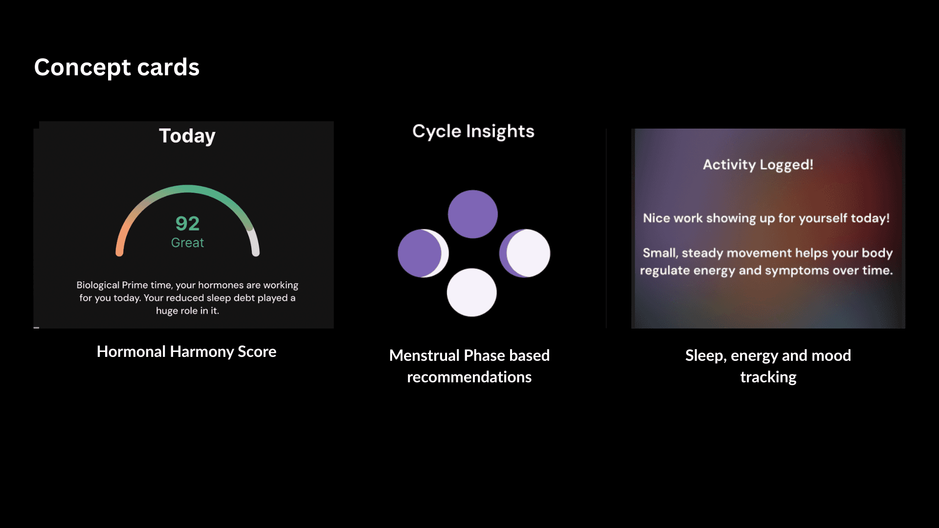
Three things make it work. A Hormonal Harmony Score that gives you a daily read on where your body is — not a judgment, just context. Phase-based recommendations that surface one actionable suggestion tied to where you are in your cycle. And a mood and energy tracker that treats emotional symptoms with the same weight as physical ones, because for PCOS, they're inseparable.
The tone matters as much as the features. Aira doesn't punish you for a missed day. It says "Nice work showing up for yourself today" and means it.
03 - Research Methods
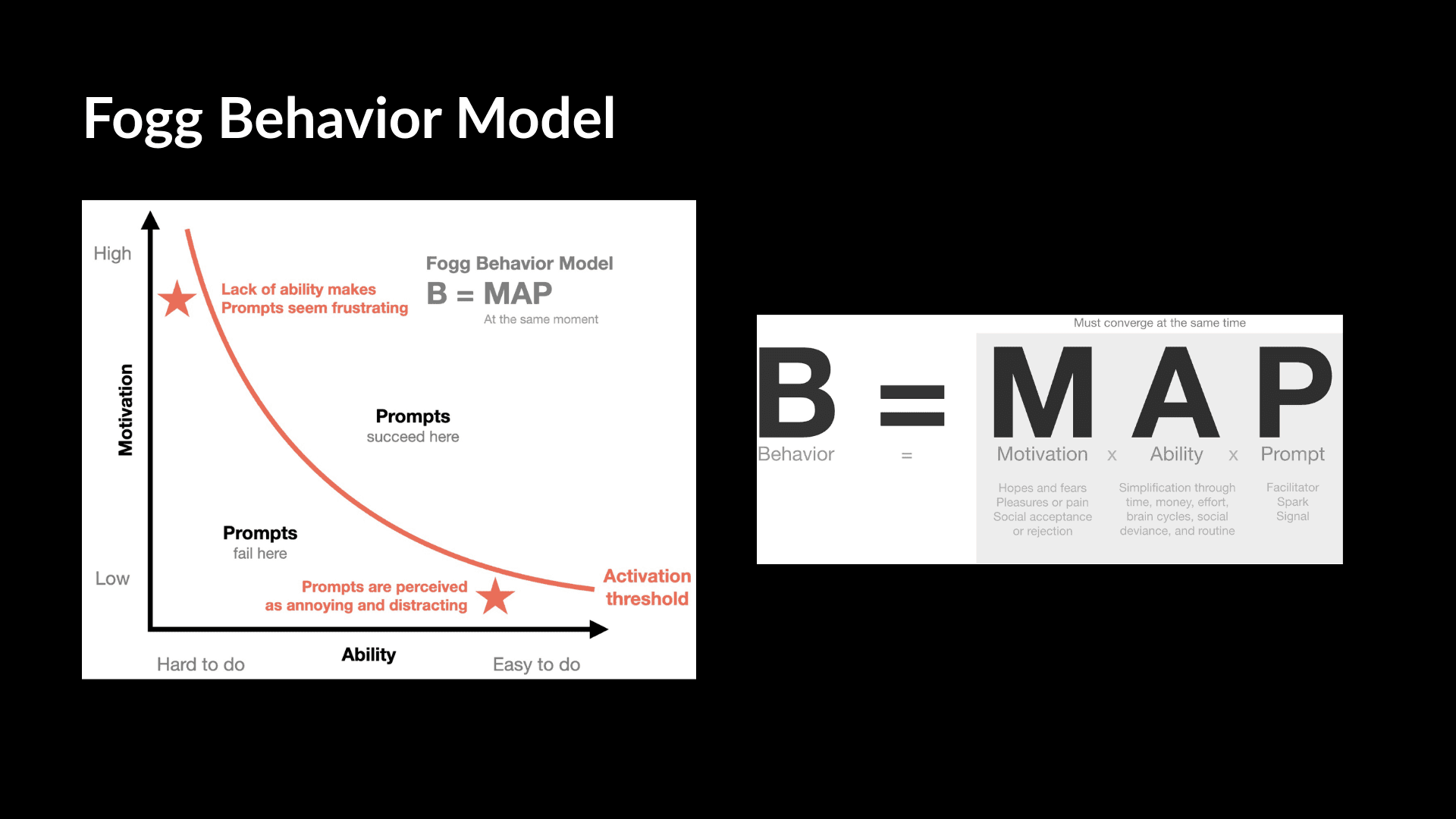
We ran two tracks of research in parallel. On the secondary side: desk research on PCOS prevalence and digital health patterns, academic papers on hormone-driven behaviour, and the Fogg Behavioral Model as our design framework. On the primary side: five 1:1 user interviews, an online survey, and — the move that changed everything — a 1:1 with an endocrinologist.
That clinical interview gave us language we could actually use. It meant every design decision had a medical check behind it, not just a user preference. When critics asked, "Is this scientifically grounded?" we had a real answer.
Four themes came out of synthesis: cycle awareness as power, the tracker fatigue cycle, the energy management gap, and the fact that PCOS symptoms are emotional just as much as they're physical. Every feature in Aira maps back to one of those four.
04 - Personas
We built two personas not to tick a box, but because research showed two genuinely different relationships with the same problem. Melanie and Aisha have different lives, different breaking points, but the same core need: a tool that works with their body, not against them.
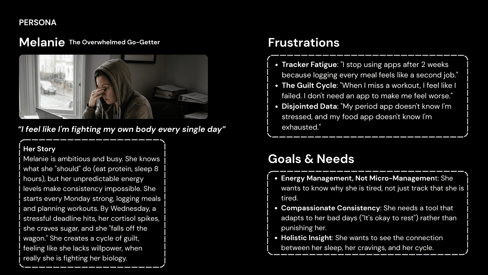
Melanie is the overwhelmed go-getter. She starts every Monday with a plan. By Wednesday, a deadline lands, cortisol spikes, she craves sugar, misses a workout, and decides she failed. What she's actually doing is fighting her biology without a map. She doesn't need more motivation. She needs to understand what's happening inside her body so she stops blaming herself for it.
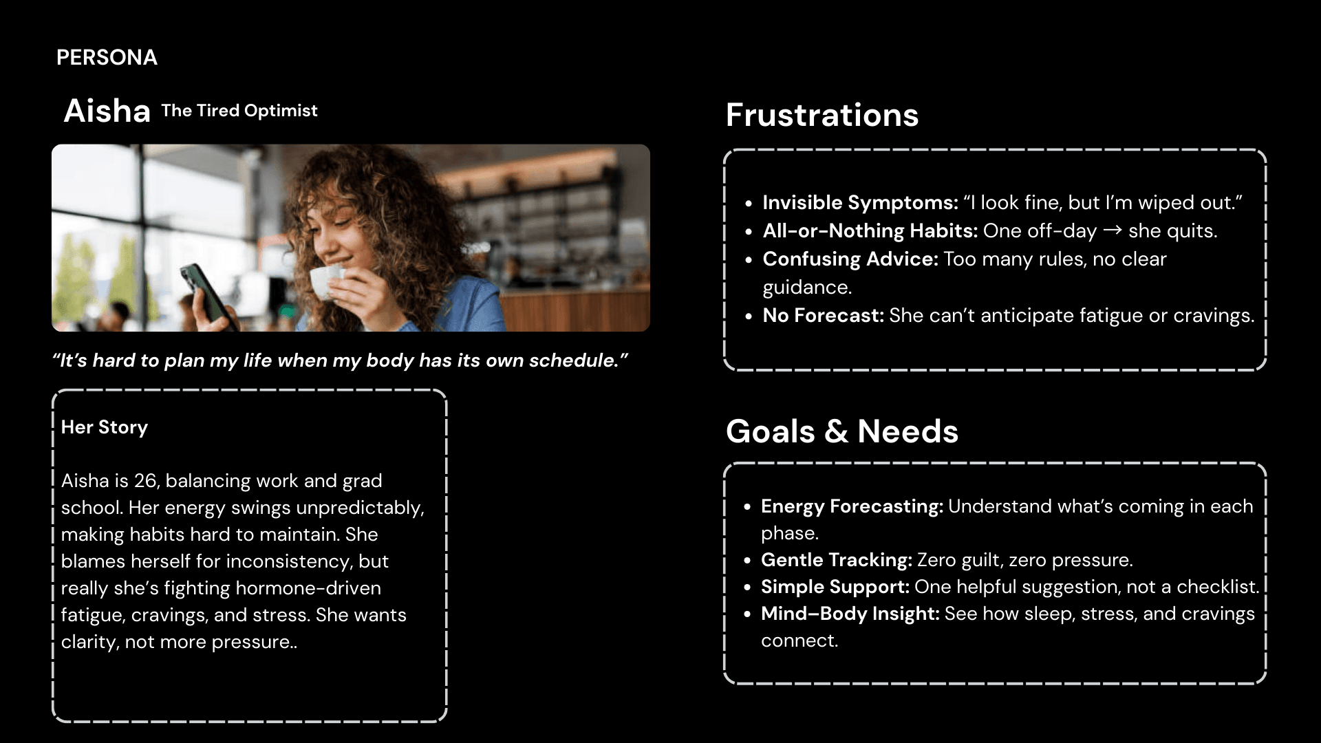
Aisha is the tired optimist. Twenty-six, balancing grad school and work, energy swinging unpredictably and no idea why. She wants clarity and zero pressure, one helpful suggestion, not a twelve-item checklist. She's ready to try again, but only if the app meets her where she actually is.
05 - Design System
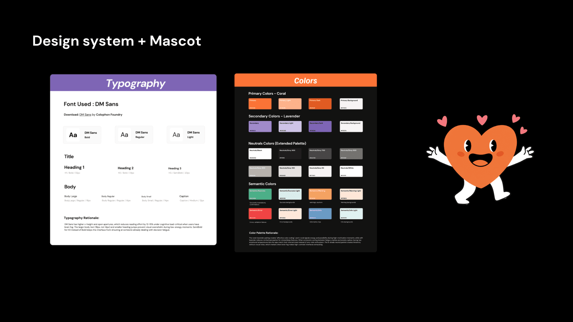
Every visual decision in Aira has a reason. We didn't pick DM Sans because it looks clean. We picked it because its higher x-height and open apertures measurably reduce reading effort under cognitive load. For users dealing with PCOS brain fog, that's not a nice-to-have.
The coral and lavender palette was chosen to avoid two traps: clinical medical green (this isn't a hospital) and aggressive bright-white contrast (exhausting when you already have brain fog). Coral signals energy and warmth for active moments. Lavender signals calm and reflection for low-energy ones. The dark background reduces visual noise across the board.
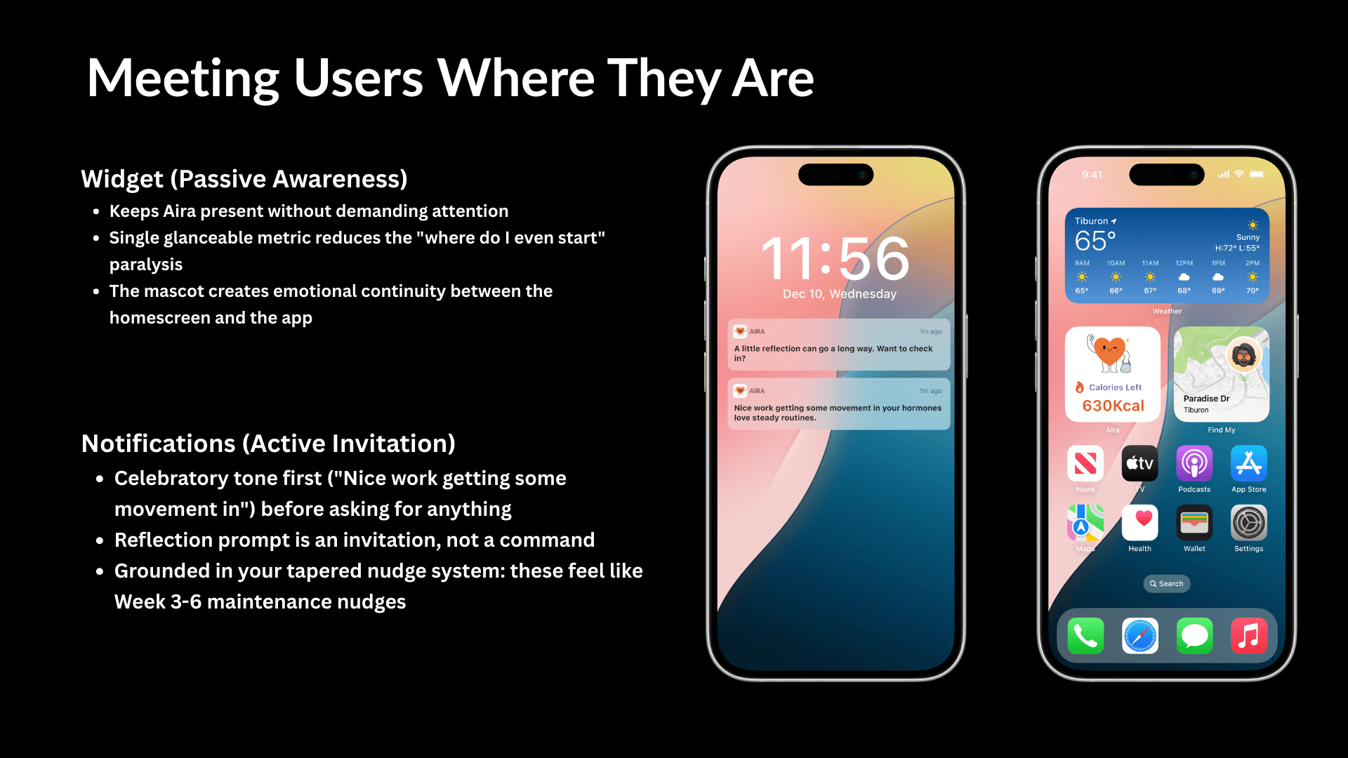
And the mascot, the little orange heart character, isn't a decoration. It creates emotional continuity between your home screen and the app. When it shows up in a notification, it feels like a check-in from something that knows you, not an alert from a database.
06 - Prototype
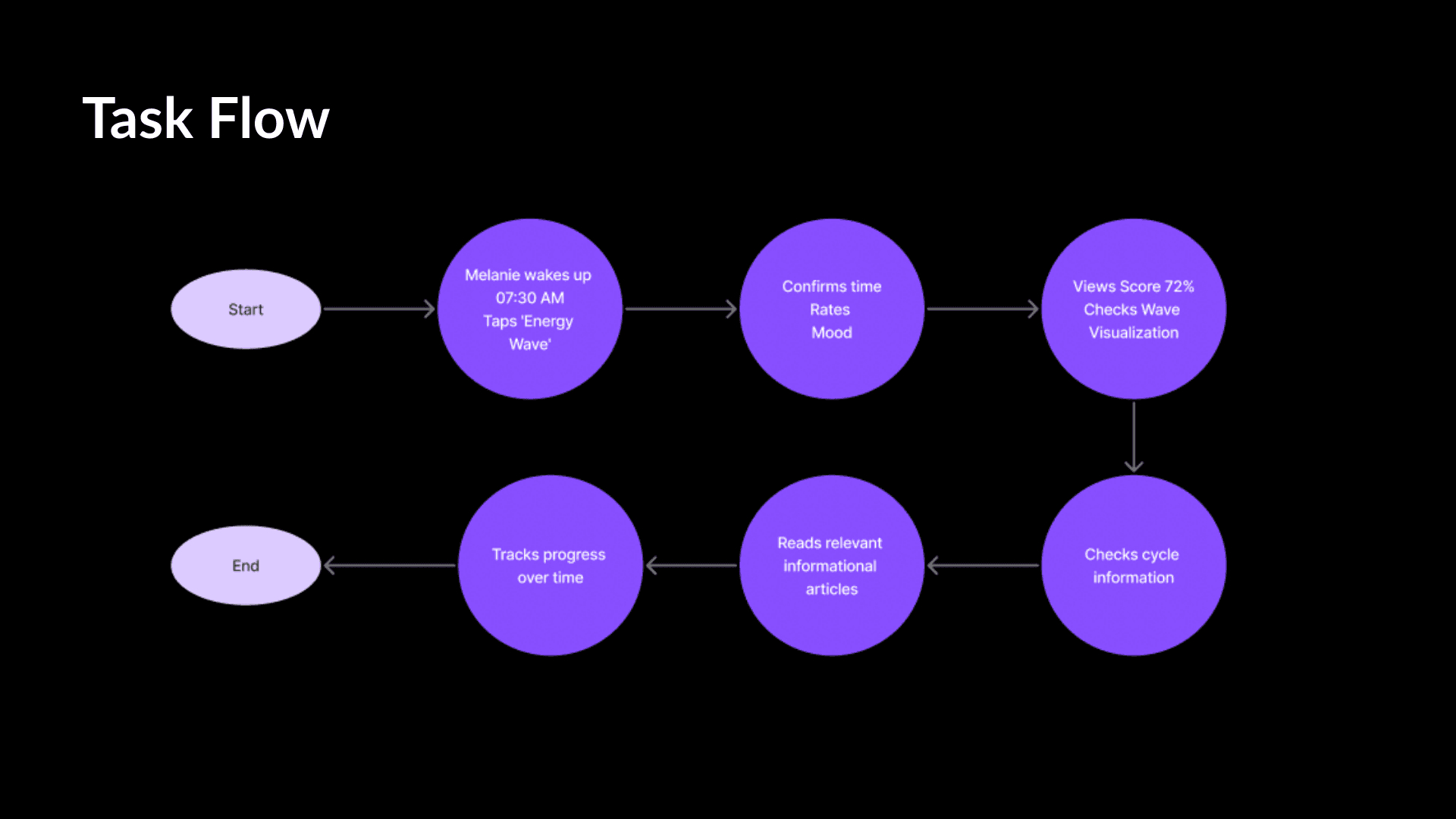
The prototype covers the full happy path onboarding, the morning Energy Wave check-in, the Hormonal Harmony Score with explanation, cycle phase insights, a phase-based recommendation, and progress tracking. Start to finish: under 90 seconds. No meal logging. No guilt.
What makes the flow different from every competitor we looked at is the inversion: the user doesn't enter data to get a record. They give a small input and get back an insight. That shift from user-as-data-clerk to user-as-recipient-of-understanding is the central design decision the entire app is built on.
The prototype was built in Figma, presented live to external critics, and demoed end-to-end with full transitions and interaction logic.
07 - Impact & Results
The moment that stuck with me from this project wasn't a design decision; it was the endocrinologist interview. Bringing in a clinical voice early transformed the work. It meant we weren't just designing something emotionally resonant; we were designing something that held up under scrutiny. Every feature had a real-world check behind it. That's a practice I'd bring into any product team on day one.
If I were running this again, I'd recruit differently. We talked to users who were already health-app-aware people willing to try one more tool. The harder, more important user is the one who's been burned twice and won't touch another tracker. That's where the real design problem lives, and I'd want to spend time there.
What this project confirmed for me is that compassionate design isn't a nice-to-have in health products; it's the product. The copy, the tone, the mascot, the score that explains itself instead of judging you. Those aren't finishing touches. They're the reason someone opens the app on Wednesday after a hard day instead of deleting it.